Sunday, October 22, 2017

Wonder Woman and John Singer Sargent

Spoilers ahead for the Wonder Woman film.  If that doesn't worry you, then read ahead and let's look at how art history influenced one of 2017's summer hits.


It is not often that a comic book movie points reference directly to art history, but Wonder Woman  does just that, crediting painter John Singer Sargent with helping to inspire the look for the film.  Even without knowing that ahead of seeing the film, you will certainly feel as though you've been immersed into a series of paintings, both landscape and interiors, and both real and fantasy.  The combination of realism with fantasy/mythology elements is characteristic of the American Renaissance period Sargent worked during, so essentially this period of art history is ideal for a Wonder Woman film.

The first element that should strike you visually about the movie is that despite using heavy blacks, it is a very colorful movie filled with a classical palette of pigments akin to yellow ochre, viridian green, prussian blue, and burnt sienna.  Sargent's affinity for heavy blacks likely came from his study of Spanish painting masters.

Background elements in the movie are often blurred to a point that they resemble a moderately loaded brush deftly painted wet onto a wet.  The use of metallic decorative accents in the backgrounds that seem to fade in and out of black space are evident throughout the movie, and to me is a trademark of many of Sargent's grand portraits that use an environment to emphasize the subject of the portrait.  In his works it's typically an ornate piece of furniture, a glare from a reflective surface, or a highlight off of a vase, to name a few examples.

Here I have placed young Diana from the movie next to a portrait of Isabella Gardner for some visual comparison, for when I saw this scene it immediately reminded me of her portrait that hangs in her namesake museum in Boston.  Notice how blacks help create ambiguous space that draw your eye in the direction of the subject.  Notice the elegant radial symmetry in each image that frames the subject.  Each is a portrait of a softly modeled woman in an ambiguous space bordering on mythological fantasy.


Looking at the closeup below of a young Diana in Figure A, we can see that the use of natural light (or at least the illusion of it) was a priority in production in order to capture a world lacking in artificial spotlights, representative the world Sargent and his contemporaries were still painting.  We see that natural light in many portraits including Mrs. Stokes in Figure B and one of the Boit daughters in figure D.  Throughout the movie closeup faces also seem to fade into blackness often, similar to Sargent's portraits like that of Madame François Buloz at LACMA in Los Angeles. 


Color tells a story by invoking a feeling within us, and in turn we associate that feeling with the scene at hand.  Yellow is often a color used to describe cheery optimism, new beginnings, and warm greetings, but in Wonder Woman it seems to have a more sinister role.  The main instances where yellow dominates the scene are at the Nazi camp, and later the scene when Diana is surrounded by mustard gas.  I like to think that in production research for the film, a search of "WWI paintings" immediately brought up Sargent's murals of gassed soldiers, and from there the idea that yellow could be a sinister hue in this movie took root.


In contrast to the soft modeling of the female faces in the movie, the look becomes more heavily textured as we move to faces of older gentlemen, as if they're intentionally being lit to emphasize the wrinkles and three-dimensional forms of the faces.  In all four images below we are getting a sense of that viridian green in the compositions, either subtle in the face and hair, or liberally in the backgrounds.  In both screenshots in Figures E and F we are seeing more examples of the deftly "painted" accent strokes in background and secondary elements, whether the collars of the men in Figure E or the door handles and military insignia in Figure F.  The end effect is a image that exists mostly in the lower register in values that has highly contrasting accented elements, all framed around a articulate, weighted, modeled face - a description that would accurately describe many Sargent portraits.


Lastly, I'd like to share one random art history reference I noticed, though not directly pertinent to Sargent. When a flashback of Ares appears in the third act of the movie, I immediately thought of Velazquez's painting of "Mars Resting," a favorite of mine though I have yet to see it in person.  This comparison could very well just be a coincidence nonetheless. 


Saturday, September 23, 2017

The Boo-Boos That Changed the World: A True Story About An Accidental Invention (Really!)

Here it is, the cover of "The Boo-Boos That Changed the World." Available in February of 2018, but currently available for preorder on the list of retailers on the Penguin Random House page, including AmazonBarnes and Noble, and others. If you are unaware of the story of how the Band-Aid came to be, where it was invented, who came up with the idea, and why the Boy Scouts of America were key to its ascent to popularity, then you'll certainly find this a enlightening and entertaining read. On my end it allowed me to visually dive into the era of the 1920s, which of course is never a chore.  Humorously written by Barry Wittenstein, it is in standard 32-page picture book format.


Thursday, July 20, 2017

Background Art for Archer Season 8 "Dreamland"

Some of my background painting work from this past season that are a culmination of great storyboarding, art direction, and 3D modeling.  For this noir season we in the background department focused on dramatic lighting springing from multiple sources and set against heavy shadows.  I particularly enjoyed working on the biker bar because it called for a bit of a Terminator 2 vibe to it, as well as the jail sub-basement and city morgue interiors.


Archer Season 8 Dreamland Backgrounds

Monday, October 3, 2016

First Picture Book & Bad Guys on Adult Swim

This fall and winter I'll be hard at work at my first picture book, produced by Charlesbridge Publishing and written by Barry Wittenstein. There's a little blurb about it here on the Rights Report at Publisher's Weekly. The work will run alongside my duties on Archer, where we're working on what hopefully you'll find to be a visually stunning Season 8. Season 7 won the Emmy for "outstanding animated program" and of course the team is hoping to do it again for Season 8. It's going to be a busy winter but I'm up for the challenge.

"Karen Boss at Charlesbridge has bought world rights for Barry Wittenstein's (l.) The Boo-Boos That Changed the World: A True Story About an Accidental Invention (Really!), a humorous take on the story of how Earle Dickson invented the Band-Aid. This is illustrator Chris Hsu's debut picture book. Publication is set for spring 2018; the author and illustrator represented themselves."

Also this past spring I painted backgrounds for an Adult Swim pilot with Bento Box, the link is here. Once there click the "Now Showing" tab up top and select "Bad Guys" from the menu. (Created by Paul Scheer and Nick Giovanetti, starring the voice talents of Keegan-Michael Key, Scheer, Chelsea Peretti, Jason Mantzoukas, June Diane Raphael, Andy Daly, and James Adomian.)


Saturday, September 12, 2015

ARCHER on FX

Long time no update...just started a gig as a background painter on Archer in Atlanta. Very happy to be on the team and looking forward to helping crank out kick ass backgrounds for Archer, Lana, and the rest of the crew to play around in.

Sunday, February 1, 2015

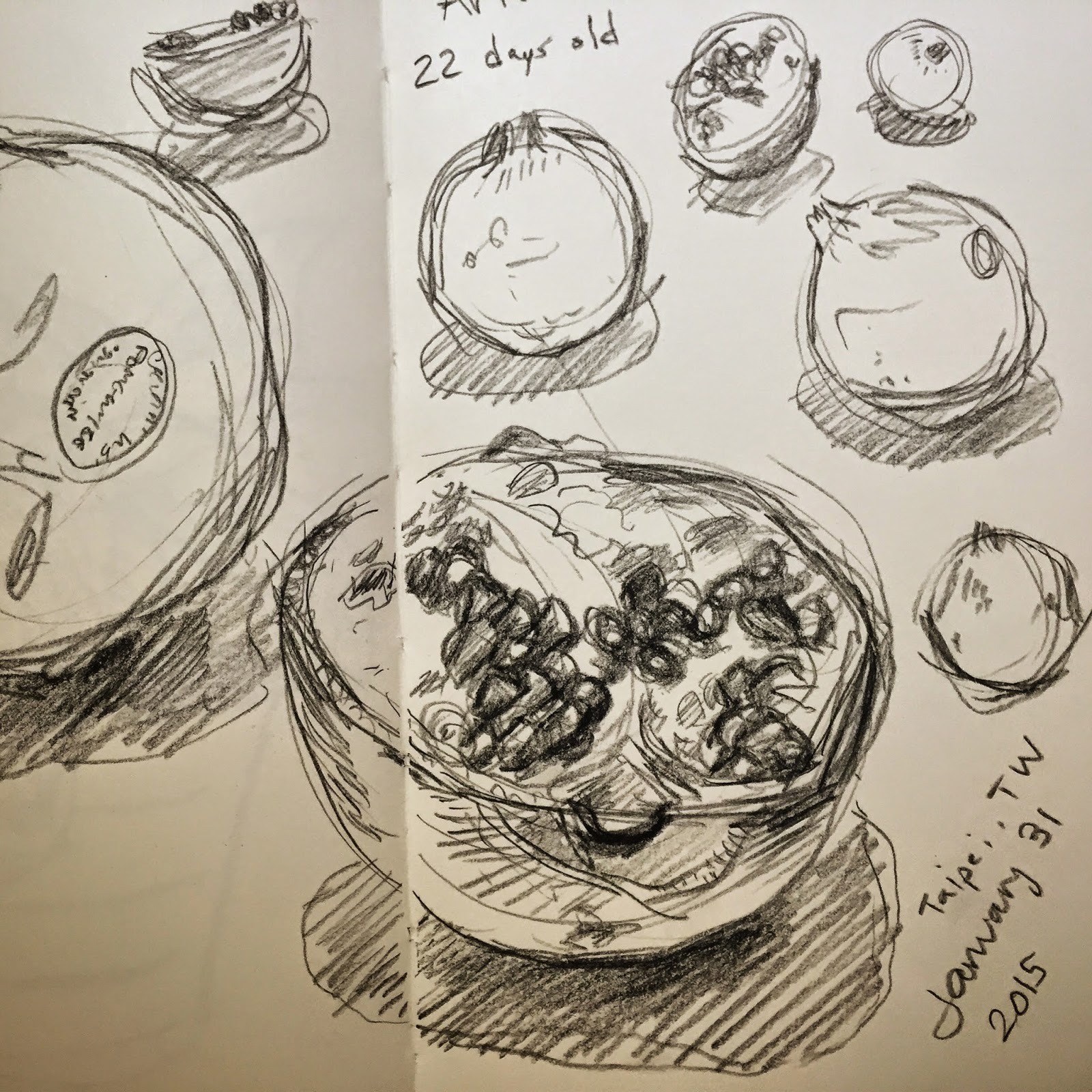
Pomegranate Sketching

Pomegranate sketching while in Taiwan. Charcoal pencil for one, watercolor the other.


Sunday, January 4, 2015

Life Drawing Updates

Happy New Year 2015! Here's a selection of life drawings from the past few months. I try to include the pencil for scale; I go back and forth between drawing small and large. I feel both approaches present their own group of challenges, and coupled along with the unique challenges that each model presents I feel it makes for a good drawing exercise.


Thursday, October 30, 2014

Folio Weekly: October 2014

Cover illustration (and some interior spots) for Folio Weekly, Oct 29 - Nov 4 issue, featuring Charlie Crist and Rick Scott.  Design and art direction by Shan Stumpf.

folio weekly chris hsu illustration

Thursday, October 16, 2014

Peter's Hill: Watercolor Study

Small watercolor study from Peter's Hill yesterday afternoon. High 70s...very unusual for New England in mid October.  Later in the evening headed over to the MFA for some figure drawing.


Thursday, September 25, 2014

Peter's Hill, Arboretum

One hour oil study from the base of Peter's Hill and looking upwards on one quiet evening. 5"x7"