
Showing posts with label illustration. Show all posts
Showing posts with label illustration. Show all posts
Saturday, September 23, 2017
The Boo-Boos That Changed the World: A True Story About An Accidental Invention (Really!)
Here it is, the cover of "The Boo-Boos That Changed the World." Available in February of 2018, but currently available for preorder on the list of retailers on the Penguin Random House page, including Amazon, Barnes and Noble, and others. If you are unaware of the story of how the Band-Aid came to be, where it was invented, who came up with the idea, and why the Boy Scouts of America were key to its ascent to popularity, then you'll certainly find this a enlightening and entertaining read. On my end it allowed me to visually dive into the era of the 1920s, which of course is never a chore. Humorously written by Barry Wittenstein, it is in standard 32-page picture book format.


Sunday, February 1, 2015
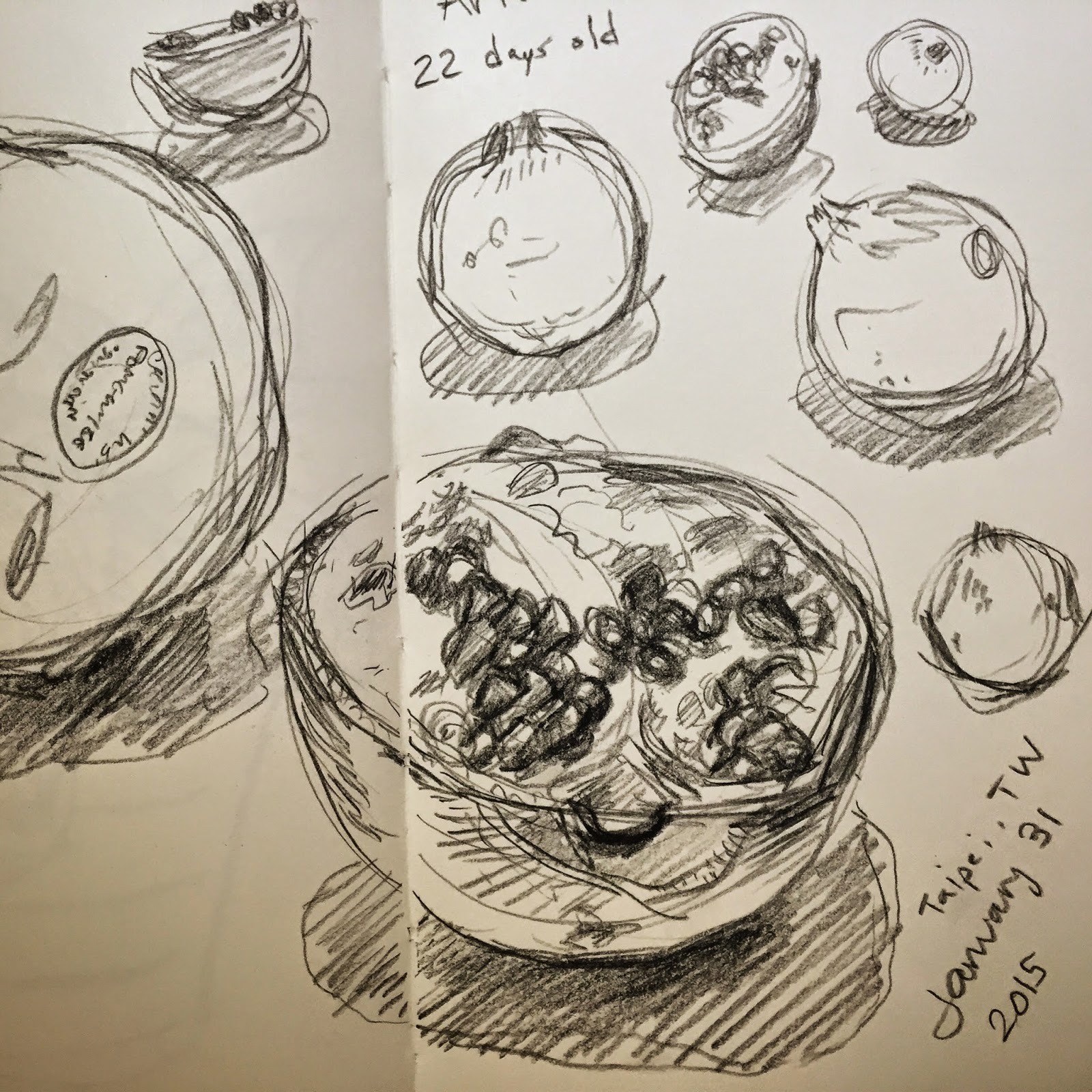
Pomegranate Sketching
Pomegranate sketching while in Taiwan. Charcoal pencil for one, watercolor the other.

Thursday, October 30, 2014
Folio Weekly: October 2014
Cover illustration (and some interior spots) for Folio Weekly, Oct 29 - Nov 4 issue, featuring Charlie Crist and Rick Scott. Design and art direction by Shan Stumpf.


Tuesday, August 19, 2014
Food Illustrations Compilation
Over many issues of My Table Magazine I've been doing a spot illustration for the "Tasting the Town" segment where the author visits five different establishments to order the same thing and write about it. I compiled all the illustrations together and thought they looked pretty interesting side by side - almost postage stamp-like even - and so here they are along with last month's topic "pretzels."


Wednesday, May 14, 2014
Excedrin Video Series
Worked with a great team at Weber Shandwick in their Boston office to create this video series for Excedrin, which highlights some easy "fast fixes" to make your life less cluttered or stressful. The videos can be found on the Excedrin website, and through the Youtube links below. We did a combination of marker drawing and stop motion effects, and yep, that's my hand...
Wednesday, April 9, 2014
Background Designs for Comedy Central
TripTank is a new animated anthology show on Comedy Central that combines an array of comedy writers, top notch voice talent, and diverse group of art styles into a half hour of animated sketch humor and weirdness. The team at Clambake Animation took on one of these animated skits "Dick Genie" written by Natalie Hazen and starring Kumail Nanjiani as Genie. For the background art I looked to bring to life a rich, fictional world for our characters to exist in, while at the same time trying to help elevate the story and humor. The background pictured below is the sleazy school janitor's closet where Billy and Genie have an encounter to discuss their plans.


Saturday, March 1, 2014
Frontier Kids: Appleseeds Magazine
Had a lot of fun with this illustration so I decided to share it here. In the March issue of Appleseeds magazine the assignment called for a vertical full spread illustration to accompany some informational copy about what life was like for kids on the western frontier and what kind of chores it would have involved. We decided the image should of course depict many of the chores for boys and girls mentioned in the text (chopping wood, tending to animals/gardens, chasing vermin, etc.) as well as be something that would work in a long vertical format.
Anyone who knows me knows that I have a serious affinity for the era of American westward expansion. Really, I have an affinity for any era, but the old West stands out to me because of the visuals - it was untamed rolling landscapes of plains, mountains, grasslands, lakes, forests, and deserts engulfing the tiny people and families who endured the hardships in hopes of new beginnings. For this illustration, I wanted to go the opposite, meaning make the kids seem bigger than life against the landscape as if they're overcoming it rather than being defeated by it. Of course once you think about larger than life figures on the western frontier, you immediately think of Thomas Hart Benton, right??
I used Benton as inspiration for this assignment, especially in the way that he composed his murals around the hard right angles of architecture (see image below.) I knew I had to deal with a rectangular box of some sort in the middle of my composition, so it just made sense. From there it was just about adding a modern children's illustration touch to it to help bring to life the text.
Anyone who knows me knows that I have a serious affinity for the era of American westward expansion. Really, I have an affinity for any era, but the old West stands out to me because of the visuals - it was untamed rolling landscapes of plains, mountains, grasslands, lakes, forests, and deserts engulfing the tiny people and families who endured the hardships in hopes of new beginnings. For this illustration, I wanted to go the opposite, meaning make the kids seem bigger than life against the landscape as if they're overcoming it rather than being defeated by it. Of course once you think about larger than life figures on the western frontier, you immediately think of Thomas Hart Benton, right??
I used Benton as inspiration for this assignment, especially in the way that he composed his murals around the hard right angles of architecture (see image below.) I knew I had to deal with a rectangular box of some sort in the middle of my composition, so it just made sense. From there it was just about adding a modern children's illustration touch to it to help bring to life the text.
 |
| Kids on the Frontier |
 |
| Design and layout by Appleseeds Magazine |
 |
| Thomas Hart Benton |
Saturday, February 15, 2014
Charles Goodyear
Here's a cropped portion of an upcoming illustration of Charles Goodyear accidentally discovering the process of vulcanization. Experimented with using more crosshatching on this one than I normally would to give it that look that art reproductions had during the time of the Industrial Revolution.

Sunday, November 24, 2013
West Coast Visit
Just messing around today with a quick doodle while watching football...always like sketching in a style I wouldn't normally, just to stretch the creative muscles. I'm about to go out to Southern California for a week so I guess I was trying to channel some of that sunny, laid back California-ness too that I remember. Haven't been there since 2007, and the first thing I'll want to eat is probably In-N-Out. First though, I'm going to stop into Cleveland for a holiday reunion with my ol' American Greetings friends. Good times.

Saturday, May 18, 2013
David Beckham Retires
Hard to believe today was the last game of Beckham's 20-year playing career - end of an era no doubt. It's rare to see an athlete transcend pop culture beyond galactic standards, while actually being a significantly, relevant player. And when you look at clips of MLS from 2007 before Beck's arrival there were just a handful of amateurish-looking teams playing in paltry college stadiums or vacant, oversized NFL arenas with depressing, faded yardage lines. It was fun, but not many people took it seriously. Investors, sponsors, casual American fans, and foreign players just kind of wrote it off as minor league in a major way. To say Beckham had nothing to do with the rapid growth and global interest in MLS over the next five years would be delusional.
It's fun to be able to say I saw him play live once - when the Galaxy played here in New England back in 2011. To commemorate his last official professional game, I did this quick portrait today.

It's fun to be able to say I saw him play live once - when the Galaxy played here in New England back in 2011. To commemorate his last official professional game, I did this quick portrait today.
Friday, May 17, 2013
Orlando Weekly Cover: May 2013
For the cover illustration in this issue of Orlando Weekly, I was asked to bring to life a simple concept: a headshot of a really excited guy with paint splattered on one side of his face and a mini golf course on the other. There's really a whole slew of ways one could go about illustrating that, so as you might imagine I had some fun with this one.
"FRINGE" refers to The Orlando International Fringe Theater Festival which is a "14-day-festival that is founded on the concept of offering 100% unjuried, 100% uncensored, 100% accessible theatre, music, dance, and art to all types and ages where 100% of the box office ticket sales go directly back to the artists within The Fringe. The Orlando Fringe is the longest running Fringe Festival in the United States, celebrating 22 years as “Orlando’s most unique cultural experience”.


(special thanks to Nathan F'in Smith for snapping this pic for me down in Orlando)
"FRINGE" refers to The Orlando International Fringe Theater Festival which is a "14-day-festival that is founded on the concept of offering 100% unjuried, 100% uncensored, 100% accessible theatre, music, dance, and art to all types and ages where 100% of the box office ticket sales go directly back to the artists within The Fringe. The Orlando Fringe is the longest running Fringe Festival in the United States, celebrating 22 years as “Orlando’s most unique cultural experience”.
(special thanks to Nathan F'in Smith for snapping this pic for me down in Orlando)
Saturday, March 23, 2013
Clint Dempsey: USA vs. Costa Rica
In one of the strangest soccer matches I think I've ever seen, the USA played Costa Rica last night in Denver in a World Cup Qualifier in a freakin' BLIZZARD. It wasn't so bad at the beginning but the it just kept snowing and snowing and snowing with no end in sight to the point where a lot of the players were sporting inadvertent snow afros. Fortunately Dempsey scored early off an Altidore shot rebound before it got ridiculous because by the second half it looked like the ball was barely even rolling across the field. I did up this little sketch today to commemorate the game.

Tuesday, December 11, 2012
HBS
Recently did some freelance work for The Harvard Business School by creating a couple series of quick illustrations to accompany video lectures by Clay Christensen. This is just one illustration from a lecture about the theory of flight, and how it applies to business theories. Very interesting stuff actually...reminded me of my old days in business school in Florida.

Tuesday, October 23, 2012
The Jay Cutler Emotions Guide
Something that came to mind as I was watching last night's Lions vs. Bears Monday Night Football game on ESPN (while simultaneously watching the presidential debate)...

Friday, October 19, 2012
"Three Cats and a Rat"
In this month's Appleseeds magazine I was given a fun opportunity to illustrate an old folktale where a swordsman and his friend try to employ cats to catch a pesky rat, though the first two cats turn out to be more high maintenance than they are skilled. The third cat, a plain tabby, uses patience rather than an aggressive approach to finally catch the rodent who upon release promises to never return.
 The story mentions a swordsman and the art director suggested maybe a Spaniard, so right off the bat I channelled what I knew of old European painting as inspiration, especially in terms of using dramatic chiaroscuro, multiple figures in complex angled poses, and setting everything in a ambiguous, darkened, rural space. Then from there I tried to combine it all into a more modern palette and look. (AD and Layout: Joshua Banks)
 In my first rough sketch for the big splash image, I thought it was important to focus on a high maintenance persian cat and emphasize that by showing the swordsman rushing over with a bowl of milk to appease it. The little blobs up top were supposed to be kittens holding a "Fight of the Century" sign as mentioned in the story, to build up the hype even more. After stepping back and looking at the sketch I felt it just showed a jerk of a cat but didn't tell anything about the relationship between the swordsman and the cat.
 I decided I really needed to include a mouse hole to show the reason that the swordsman is cajoling the cat. But at the same time the mouse hole alone wasn't enough to show the gravity of the situation - that was where the friend from the story came in handy. I placed him waiting to pounce by the entrance, thereby suggesting that there was something actually pesky inside that hole that the cat wouldn't even attend to until fully fed. Perfect...except for the fact that the composition became incredibly left-heavy at that point.
 With some tweaking of the figure I changed him to better fit my needs there, which were to 1) balance the composition and 2) support the narrative. This arrangement also had a unexpected benefit too, which was how the shape of the cat now looked like it was literally stepping on him, as if he was a slave to that cat. I thought it helped to subconsciously push that idea that this was really one high maintenance animal. Plus I already had a composition comprised of many "U" shapes in varying sizes and curves, so putting the friend in a big "U" helped to hold everything together and perpetuate the rhythm.
 Voila! Now I felt like I had a composition of dynamic implied lines and shapes that helped to tell the specific narrative, and I could finally move forward confidently with the rest of the character design, drawing, and painting. Below are the other two smaller illustrated spots that accompanied the story. I already decided early on that the rat was going to appear in both of those, which is why I never included it in the initial sketch for the splash image.


Thursday, October 18, 2012
"The Spider Man"
For this month's issue of FACES magazine the assignment called for two spreads featuring a character named Anansi, a plucky spider from Caribbean folklore whose message in a nutshell is to never give up, even if you think you are small and insignificant. It's a suuuper trippy story that jumps from abstract scene to abstract scene so the concept for the illustration was very open ended. The only guideline I set for myself was to make sure to give it a hint of Caribbean characteristics in terms of character designs and palette. Below are the finals of the two spreads, plus a detail. I took a little inspiration for the ghost fight spread from Disney's Haunted Mansion in Orlando, which being a native Floridian I have ridden many many in my life. I always remembered that part in the ride where a swirl of transparent ghostly figures flies through the air in a big arch...if I remember correctly it's right before the ride car heads down into the cemetery? (AD and Layout: Joshua Banks)


Thursday, October 4, 2012
Google "Tough Mudder" T-Shirts
In a fun little side project, a good friend of mine who is a Music Partner Manager at Google in Mountain View asked me if I could help them out with a little something for their upcoming Tough Mudder outing. If you're not familiar Tough Mudder is one of those obstacle-laden, guaranteed-to-get-you-muddy races held out in the countryside that tests your physical and mental abilities.

So they wanted to go with an Android theme based on a little image of the standard, frontal mascot icon dressed in running gear that another Google designer had done. My task was pretty open ended, so I decided to make it my goal to take that and "bring it to life" somehow in the spirit of the race using only three colors and white.

We ended up going with what we referred to as the "roaring guy" which we felt captured the "Yeahhh! Bring it on!!!!" feeling that people usually have when they first start these races before they find out how challenging "it" actually is. This is an actual photo of the printed product even though it kinda looks like it's photoshopped onto a random T.

The big day has arrived! Here's a contingent of NorCal Google employees sporting the shirts this past weekend. Man, those bright, yellow ochre mountains of California seem like a whole world away from the fall forests of New England...

Here's a great shot of the front and backs of the shirts. From what I heard, a good time was had by all and everyone returned home safe and sound in one very muddy piece.

So they wanted to go with an Android theme based on a little image of the standard, frontal mascot icon dressed in running gear that another Google designer had done. My task was pretty open ended, so I decided to make it my goal to take that and "bring it to life" somehow in the spirit of the race using only three colors and white.

We ended up going with what we referred to as the "roaring guy" which we felt captured the "Yeahhh! Bring it on!!!!" feeling that people usually have when they first start these races before they find out how challenging "it" actually is. This is an actual photo of the printed product even though it kinda looks like it's photoshopped onto a random T.

The big day has arrived! Here's a contingent of NorCal Google employees sporting the shirts this past weekend. Man, those bright, yellow ochre mountains of California seem like a whole world away from the fall forests of New England...

Here's a great shot of the front and backs of the shirts. From what I heard, a good time was had by all and everyone returned home safe and sound in one very muddy piece.
Saturday, June 23, 2012
Euro 2012 Spain Sketches

Did some quick sketches of some of Spain's football/soccer players while watching the Euro 2012 game today vs. France. These are some of the more high profile guys (Xabi Alonso, Andres Iniesta, Gerard Pique, Cesc Fabregas, Iker Casillas, Fernando Torres) but it'd be fun to draw out the rest of the team and complete the set.
By the strangest and coolest coincidence ever, we saw these guys when they were staying in Providence in Spring 2011 while staying in the same hotel as them during RISD's graduation weekend. Of course they obliterated the US team in an exhibition in Foxboro, but we got all kinds of good pictures with the players in and around the Providence Mall during that week.

Monday, April 30, 2012
Cobblestone Publishing: April Illustrations
Late posting! For the month of April I was happy to have produced illustrations for not just one, but two Cobblestone magazine titles - Odyssey and Faces. The Odyssey assignment called for a vintage-looking ad for geomedicine products by mail order. I like to think my general knowledge of science is pretty good, but I'll admit I had NO idea what "geomedicine" was; but I find learning something new is the beneficial side product of illustrating for a science magazine.
 Faces Magazine is Cobblestone's world cultures topics publication for kids and was a new venue for me this month to my delight. The gig called for a series of narrative illustrations showcasing three ancient and witty Arabic folktales told from the point of view of a wise old man named Mullah, who also stars in each story as a character. The settings range from a restaurant, a lavish party, and the open desert. When you think about it, it's funny how so many ancient folktales around the world are based on either food or social statuses...


Wednesday, March 21, 2012
RISD Portfolio Review 2012
Took part in the RISD portfolio review today on behalf of Clambake Animation with my boss. Really enjoyed what I saw of the students and the campus, and thanks to everyone who stopped by the Clambake table to show their illustration and animation work!
Subscribe to:
Posts (Atom)